Fabriano Ecoqua Pocket Notebook Review

After being pleasantly surprised by the paper in the Fabriano Ecoqua Gluebound, I bought a 4 pack of pocket notebooks at my local Plaza Art. Write Notepads and Story Supply Co. are my favorites for pocket carry but I’m always searching for more options.

Specs: 

  • 4 pack, in “warm” and “cool” colors
  • 85gsm “Bioprima” ivory acid-free paper
  • $9.50-11.00
  • 32 sheets, 64 pages
  • 3.5″ x 5.5″, pocket size
  • 4mm dot grid
  • staplebound

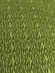
The Fabriano Ecoqua Pocket Notebooks come in a set of four “warm” colors, red, orange, yellow and green. There is also a “cool” set available. They have a bellyband and a packet with more information about Fabriano. The cover is made of a thick textured paper that stands up to daily carry well. “Fabriano” and “Made in Italy” are printed in faint silver ink on the back. The paper corners are rounded off. Compared to the gluebound, I think these notebooks would hold up well in my bag. Two staples hold the notebook together. It could use another staple because it’s hard for this notebook to stay flat.

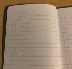
The paper is the same as the gluebound, ivory with light 4mm dots. The paper holds up well to pencil, gel pen, and fountain pen use. There is shading and a bit of sheen, and no feathering! Show through is minimal. The Inkjoy and Zebra Sarasa shows through more than my fountain pens. The pages are slightly textured, providing a pleasant tooth when writing. The second half of the notebook has perforations for tearing out pages. It tore out cleanly when I tried.

One issue I found was that the dry time for fountain pens was longer than I’d like. It took 10 seconds for the ink to dry. This is okay for larger notebooks but in pocket notebooks, I write quickly then close the book. Write Notepads also has a long dry time of 10 seconds but Story Supply Co. takes only 3 seconds! I also found it hard to make the Fabriano stay flat because of its two staples and thick paper. Finally, part of my notebook cover is discolored but that’s not too much of a problem, just annoying.

These notebooks are a great deal for the price! I love how they include four books instead of three, contain great paper, and come in fun colors. I recommend them if you want quality notebooks for a good price.

I bought these notebooks with my own funds. I was not paid for this review. 


Fabriano Ecoqua Gluebound Notebook Review

I bought the Fabriano Ecoqua Gluebound notebook at my school bookstore some time ago. I’ve seen the Fabriano brand in art stores before but not commonly elsewhere. So I picked it up, not realizing that it was gluebound! It’s not my favorite binding but I think the notebook will be useful for people who want to tear out notes or make lists. Here’s my review:

Specs: 

  • 85gsm “Bioprima” acid-free paper
  • $5.20-6.50, based on where you buy it
  • 90 sheets, 180 pages
  • 5.8″ x 8.25″, A5
  • 4mm dot grid
  • gluebound

IMG_9054

The Fabriano Gluebound is a slim A5 notebook with a textured paper cover. Mine is gray, but there are several bright colors to choose from. Fabriano is printed faintly on the front in silver ink and it looks classy. The corners aren’t rounded so they could get dinged up easily. Some of the paper sticks out from the edge. I don’t think the notebook would last long in my backpack with its thin, light construction. This is more of a desk pad to me.

Inside is a slim block of 85gsm paper. It’s cool to see the binding on the side. The notebook lays flat easily due to being gluebound. However, I’m not sure how sturdy the binding is. I’ve seen reviews where people say the pages tear out by themselves, but that hasn’t happened so far for me. The pages are easy to tear out and don’t leave any pieces behind.

Now, onto the paper! The dot grid is smaller, 4mm compared to the average 5mm. However, the dots are light and fade into the background easily. The paper has some texture to it, that my finer fountain pens catch on. However, I like some texture when I’m writing. It’s not as toothy as Baron Fig paper, but not as smooth as Tomoe River.

I was surprised by the quality of the paper! It shows some shading and even a bit of golden sheen in my sample of Taccia Momo. I didn’t see any feathering or spreading of ink. The paper is ivory but shows off the ink well. Pencils do well on the textured paper. However, I felt like my finer pens felt more scratchy. The showthrough isn’t bad either. The juicy Zebra Sarasa and Pentel Energel left more showthrough. I’d use both sides of the page. It took 10 seconds for fountain pen ink to dry. It’s a good budget option for fountain pens.

I’d suggest using this notebook for taking quick notes and making lists. Don’t use this as a journal or repository for important writing because the pages are meant to be torn out. I’ll use this for making lists of my homework and tasks to complete. They are also easy to find online or in art supply stores. There are several types of Fabriano Ecoqua notebooks, including in pocket-sized, staplebound and spiralbound versions. I bought a pack of Fabriano pocket notebooks so look for a review of those soon!

I bought this notebook with my own funds. I was not paid for this review. 

Musgrave Tennessee Red Pencil Review

I bought the Musgrave Tennessee Red pencils after hearing that Musgrave revamped their brand and added new pencils. I’ve mostly stuck to Blackwings and Japanese brands, so I haven’t tried many American pencils. There are only a few American pencil companies left, so it’s important to support them! Also, a dozen Tennessee Reds are only $9, compared to $25-28 for a dozen Blackwings. They are made of Tennessee red cedar instead of California cedar. Apparently, that’s what Musgrave pencils were made out of until the ’60s. Luckily, Musgrave found a new source of the wood!

However, there are quality control issues with the pencils, which I want to mention up front. In their blog post, Musgrave says that because they are new to working with this wood, some pencils will have off-centered lead or will be slightly warped. I’ll explain the issues I found with my pack later.

Specs:

  • $9 for a dozen
  • #2 core
  • natural finish with clear coat
  • sharp hex

My pencils came in a beautiful red slipcover, with the words Tennessee Red in vintage-looking letters. They are stunning! The pencils are natural but have a clear gloss over them. Tennessee Red reminds me of a hardwood floor, with a similar smell. They aren’t as fragrant as Blackwings but still smell delicious! There are interesting whorls and variations that make each pencil unique. One of my pencils looks like a black and white cookie, with one half a lighter color than the other! I love the vintage red imprint but I wish that it showed up more against the dark wood.

IMG_8939

They also have a very sharp hex, which means the edges are hard. It digs into my fingers. I wish that the edges were softer like Blackwings. I liked the combination of red with the golden ferrule and white eraser. Sadly, the eraser isn’t very usable, but most aren’t!

The hex is #2 but feels softer. It’s similar to Palamino HB. It’s smooth and dark on paper with some tooth. I tested it on Write Notepads and it was great. I didn’t feel any grit or scratchiness like I do with some pencils. It also has kept its point despite writing pages of notes. It’s a contender for my favorite lead, with the Blackwing 602 still holding first place.

IMG_8936

However, I had quality control problems with my pack of pencils. I’d say 3-4 of mine are off-center. Even worse, one of them was completely messed up. It looked like the two slats were misaligned. It looks impossible to write with. They are also hard to sharpen, especially in hand-held sharpeners. The wood is thick and dense. I used my brass Möbius and Ruppert sharpener which worked but it took some effort. Finally, the hex is much too sharp for me.

IMG_8920

I also was given two free pencils in a sleeve, a Musgrave 600 News and Musgrave Bugle. I loved the dark, smooth lead of the News, but I broke the tip instantly. It seems perfect for sketching! I didn’t like the Bugle, it was too light and scratchy. Both pencils felt lightweight without a ferrule and eraser.

I love the idea of the Tennessee Red pencils but I think better quality control needs to go into the next batch. At least Musgrave was honest and wrote a blog post explaining the issues. They also aren’t very expensive compared to Blackwings. If you’re okay with potentially getting off-center cores and love the beautiful red cedar, then I would purchase. I bought a pack for my mom and she loves them! Otherwise, I’d recommend waiting for the next generation of these pencils.

I bought this notebook with my own funds. I was not paid for this review. 


Goulet Notebook with 68gsm Tomoe River Paper Review

Sorry for not posting recently! My school closed because of coronavirus so I’m back at home now. Things are scary right now and I’m glad I’m with my family. I also have all my notebooks and fountain pens. Self-isolation gives me more time for reviewing at least…

Goulet Pens is a staple of the stationery sphere online. I bought my first fountain pen, a teal Pilot Metropolitan, from there in 2016! Not only does it sell pens, notebooks, and ink, but it also sells its own brand of Goulet Notebooks. Their brand fills a niche of slim, Tomoe River inserts that can easily be slipped into a cover. I’ve seen plenty of them on Etsy but I’m glad that Goulet makes their own that are simple and inexpensive. I don’t use inserts, but I bought a Lined A5 Goulet Notebook with 68gsm Tomoe River paper to try out. I prefer lines, but they are not always available with 68gsm paper.

Specs: 

  • White 68gsm Tomoe River paper
  • A5 size
  • 7mm lines
  • 64 pages
  • rounded corners

IMG_9075

The Goulet Notebook comes in a plastic wrap with a sticker on the front. Otherwise, there’s no branding. There’s no easy way to tell what the front or back is, so I stuck on a cute bee sticker that was included with my purchase. The notebook is slim and light. It’s a standard A5 size so it will fit into a cover. The cover is textured but not very sturdy. There’s 64 pages inside, which isn’t as many as the 96 pages inside of the 52gsm version. However, this paper is thicker and the type I prefer to use.

IMG_9072

The inside is luscious 68gsm white Tomoe River with lines, my favorite! However, it doesn’t live up to the dotted light-gray lines in the Hippo Noto. The lines are a bit too dark for my taste. The pages lay flat easily.

The paper is perfect of course. All my fountain pens showed shading and sheen. None of my nibs felt scratchy on the paper. There was no feathering. It took 20 seconds for my fountain pen ink to dry. The best part is that 68gsm TR has much less show through than its 52gsm cousin. I compared the showthrough on the back page of the Goulet Notebook with the back page of a Nanami Cafe Note B6. There’s much more with the thinner paper, which makes it annoying to use. It is easier to use the back once you write on it, but I still prefer 68gsm for its thickness.

Overall, the Goulet Notebook is a good choice if you want inexpensive Tomoe River paper, enjoy slim notebooks, or need inserts for a cover. But if you want a bigger journal, you should look elsewhere. The Goulet Notebook comes in several sizes and with 52 and 68gsm paper. Sadly, Goulet Pens isn’t fulfilling orders because of coronavirus. But when they are back, this notebook is a great choice to add to your cart.

I bought this notebook with my own funds. I was not paid for this review. 

Hobonichi Weeks Planner Review

I thought that my Quo Vadis Weekly Planner would be enough for school assignments. Then I started missing my other non-school appointments. My Quo Vadis was so crowded with schoolwork and exam dates that I didn’t have much room to write down other obligations. I’m naturally a very disorganized person so as school gets harder, I have trouble juggling all my commitments. I thought about using Google Calendars, but technology distracts me. So I bought a Hobonichi Weeks of course!

Specs:

  • Cream 52gsm Tomoe River paper
  • 3.7″ x 7.4″
  • 240 pages
  • $25, though there are variations that are more expensive
  • Calendar format, yearly overview, monthly pages and weekly pages
  • Extra pages at the back
  • Thread and glue binding

IMG-8279


The Hobonichi Weeks is different from its more famous sibling, Hobonichi A6 Techo. It is taller and narrower, and comes into a horizontal weekly format. It also has cream 52 gsm Tomoe River paper instead of white. It’s also less expensive at $25 compared to $37 for the A6 and $52 for the Hobonichi Cousin.

My Weeks has a red fabric cover. I was supposed by how flimsy the cover felt! It’s not very protective. I already accidentally crumpled the pages inside so I wrapped a rubber band around the outside to keep it shut. The cover does feel nice to touch though! There are two thin bookmarks that are already unwinding. 2020 is embossed on the cover in gray ink. The Weeks doesn’t lay flat sadly. I always have to push the pages down with my hand. It’s very light because of the thin pages inside! It doesn’t weigh down my backpack at all. I really like how slim and light this planner is. It came with an adhesive pocket sticker that I attached to the back.

IMG-8274

The interior has cream 52 gsm Tomoe River paper. I love this paper but it’s somewhat impractical for a planner. I keep on leaving ink stains on the opposite side of the page because it dries so slowly. Fountain pens feel great on the paper. Shading and sheen show up in my pen test. My Zebra Sarasa and Pilot Precise V5 work well on the paper, but the Pentel Energel takes forever to dry. Using Sailor Tokiwa-Matsu ink, it took 20 seconds to dry on the paper! That’s quite a while for a planner I’ll be opening and shutting constantly.

There is a calendar, yearly overview, monthly pages, and weekly pages. There are pages in the back and quotes throughout the pages but they’re in Japanese. A set of memo pages are in the back of the book, which is helpful for making lists or activity tracking. I enjoy the light 3.6mm grid that is used in much of the book. It gives me structure but isn’t too distracting. There is one month per spread, with room on the side and bottom for lists. I’d rather that the calendar was bigger though. The weekly spread has the week on the left side and grid paper on the right side. I’d prefer if the week continued on the right side so there’d be more space. However, I’m using this only for writing down appointments and deadlines so it doesn’t matter as much.

Overall, I like the size and slimness of the Hobonichi Weeks but its format and paper isn’t perfect for me. I’ll keep using it this year then switch to Google Calendar or another planner. But if you like the format and its size, I’d recommend it. The Weeks is unique among the Hobonichi planners because of its horizontal weekly format. There is also an April start planner available. It’s not too late to pick one up at Jetpens!

I bought this notebook with my own funds. I was not paid for this review. 


Ink Inventory 2019!

I did some late summer cleaning of my room last week, which involved clearing off my entire desk of all fountain pens, inks and notebooks. :O I took the chance to count up all my inks I’ve bought over the last three years of my obsession/hobby.

The final count: 64 bottles! I’ve made a list of all the brands I have, sorted by amount.

  • Robert Oster: 8 bottles
  • Monteverde: 7 bottles
  • Pilot Iroshizuko: 6 bottles
  • Sailor: 6 bottles
  • J. Herbin: 5 bottles
  • Kobe: 3 bottles
  • Kingdom Note: 3 bottles
  • Kyo No Oto: 3 bottles
  • PenBBS: 3 bottles
  • Lamy: 3 bottles
  • Diamine: 3 bottles
  • Taccia: 2 bottles
  • Bungubox: 2 bottles
  • Krishna Inks: 2 bottles
  • Callifolio: 1 bottle
  • Papier Plume: 1 bottle
  • Organics Studio: 1 bottle
  • Colorverse: 1 bottle
  • Noodler’s: 1 bottle
  • Nemosine: 1 bottle
  • Akkerman: 1 bottle
  • Vinta: 1 bottle

Robert Oster and Monteverde top the list in terms of amount of bottles. Not only are they wet, shading inks but they also are much cheaper than Japanese inks. I buy them because they’re inexpensive and come in many colors. J.  Herbin is also nice and only felt watery in Perle Noire, which I promptly gave away. Iroshizuko and Sailor are my absolute favorite brands but because of cost I don’t have as many. They exhibit the best shading and sheen!

My favorite inks overall are Iroshizuko Ku Jaku, Iroshizuko Yamabudo, Sailor Sky High, Sailor Apricot, Monteverde Ocean Noir, Lamy Dark Lilac, Kobe #48, Robert Oster Cherry Blossom, Bungubox June Bride, J. Herbin Rouge Grenat, all my Kingdom Note inks, and Taccia Uguisu. I love teal, blue and red inks most of all. I’m most proud of getting a bottle of Lamy Dark Lilac and several boxes of cartridges! It was a lucky find at the D.C. Pen Show in 2016. I missed all the hype about it before because I was just getting into the hobby then.

Here are some individual pictures of my collection. I put them in a slide show so you can see them.

This slideshow requires JavaScript.

Most of the inks I disliked I got rid of, but there are still some in my collection I’m meh about. I enjoyed Robert Oster Frankley Blue until dried ink crystals from the bottle cap exploded all over my desk. Nemosine Coalsack Nebula is a beautiful shimmer ink but clogs so much. J. Herbin Emerald of Chivor was the most hyped ink of 2016 but didn’t live up to my expectations.

My emptiest bottle is Ku Jaku, because it’s a beautiful teal but mostly because its cap is cracked and there was a leak at some point. I only have 1/3 left. Yamabudo is close, with 2/3 left. Robert Oster Frankley Blue and Sailor Okuyama also have a good amount used up, also because of leaks. The rest aren’t even close! The problem with having so many inks is that I use different colors each time I write. It never gets boring but I also go through inks slowly.

I hope you enjoyed looking at my ink collection!

Notebook Shopping at Target

I loved back to school shopping as a child! It was the one time where I was allowed to pick out a giant stack of notebooks, pens, pencils and other stationery. I stalked the aisles, grabbing enough supplies to last the whole year and then some. Some of my favorite notebooks had floral designs, T.V. show characters, or glittery covers. There were fun trends too, like the year everyone bought Japanese erasers and bendy rulers! As much as I love fountain pen friendly stationery, the designs are often muted and boring in comparison. So I decided to look for that childhood wonder at my local Target. The mission was to find cute, but fountain pen friendly composition notebooks. Yes, I was inspired by Les from Comfortable Shoes Studio and her reviews of back to school notebooks. 🙂 I tested paper using an EF Blackwing, Sharpie Pen, Papermate Flair and Papermate Inkjoy, along with my currently inked pens.

IMG_9954

My go to used to be Studio C, which always had pretty covers but also had paper that showed off shading and sheen! Unfortunately, they went out of business and don’t show up on shelves anymore. 😦 My stockpile won’t last me forever, so I was looking for a replacement. Here are the specs for one of mine:

Studio C College Ruled Composition Book

  • 100 sheets
  • $3.49

IMG_9970

The one I tested was from the Silver Linings collection. I love the silver tape and motivational quote, “Live Your Dreams” on the front cover. The inside is just as lovely as the inside. The lines are college ruled and a pale blue. The paper skews cooler than the other notebooks I tested. It is wonderful for fountain pens, showing shading and sheen! The notebook is durable. The cover is made of thick cardstock that doesn’t bend easily.

Mead College Ruled Comp Book

  • 70 sheets
  • 99 cents

IMG_9959

The hot pink cover and tape lured me in, despite the ugly page of coupons attached. The plastic cover is sturdy enough despite not being cardstock. It also has a plastic page sandwiched in between the cover and pages which is nice. However, the paper inside was disappointing. It was rough under my pen. In my drying test, the ink was absorbed in under three seconds. The lines are a dark blue and don’t blend in. Nibs were a size larger on this paper. There was no shading, only a flat color. I saw feathering too. There was show through and bleeding too. I don’t recommend this paper! Even my Blackwing felt unpleasant.

Mead Five Star College Ruled Composition Book

  • 100 sheets
  • $2.49

IMG_9962

I was really hoping this could live up to the Studio C, but sadly it doesn’t. It has has 100 sheets but is a lower price. The cover has white tape and a pretty image of swirling paint.  The plastic cover sticks to the front and back pages so I have to pull them apart every time I open the notebook. My writing size stayed close to normal instead of increasing in width. There was also shading. But there was feathering in my larger nibs. My blue inks, like PenBBS #44 and Bungubox June Bride seemed to bleed through to the back more than Kobe Arima Amber. I could still use this with smaller nibs and red colors apparently. Show through is okay except for blue and green inks which bled more!

More than Magic Wide Ruled Composition Book

  • 80 sheets
  • $1.99

img_9989.jpg

This was the best notebook of all! I only wish it came in college ruled and had more pages. More Than Magic is a Target brand that sells sparkly, holographic, cosmic- themed school supplies. I was attracted to their “stand” instantly, guess I’m still a child at heart. 😀 The notebook has holographic tape and writing that says “Find your light” behind a purple space background. Inside is another quote, “You are amazing”. The lines are wide ruled and not too dark for me. This was the best paper yet! All my pens behaved well, with shading and a bit of sheen. No feathering either. It took longer to dry fully, 15 seconds, but that means ink had time to pool and create shading. There was a negligible amount of show through on the back.

West Emory Composition Book

  • 50 sheets
  • Forgot the price

IMG_9969

I know this wasn’t a real composition book despite being labeled one. But I couldn’t resist the holographic cover. This notebook had light gray lines and space at the top for headings. Sadly, the paper also was absorbant, so ink took only five seconds to dry. My lines increased in width. There was splotching where ink usually pools. Show through wasn’t bad except for the PenBBS #44, which is a very pigmented ink.

Overall, if you’re looking for cute, colorful composition books I’d check out More than Magic, Mead Five Star if you experiment with inks that work, or Studio C if you find any remaining stock!

Mini Review: Oasis Notebook

Sorry about not updating! I’ve been busy settling into school and getting used to my course work. Here are my thoughts about a new notebook I found: The Oasis Notebook.

I first discovered the Oasis Notebook when I received it as a gift at the July D.C. Pen Meetup. It was elegant, sturdy and lay flat too! I was afraid I wouldn’t be able to find it again. Luckily for me, they were available at the D.C. Pen Show, right next to the Sailor table.

Profolio is a new brand from Japan, made by the famous Itoya stationery company. All of their products feature a hybrid graph ruling, using both grids and lines. They can be used for taking notes, making diagrams or tables, or writing lists. There’s a space at the top to write a date. I bought the regular A5 Oasis in a “stealthy” black and a limited edition A5 with white paper.

The Oasis lays perfectly flat, perfect for long term writing. The paper is a nice cream color. There’s shading but no sheen unfortunately. I didn’t see feathering or bleed through but there is some show through because of the thin paper. It’s very smooth and pleasant to write with. The limited edition is the same except it uses bright white paper. It’s staple bound, so doesn’t lay flat. The cover springs up once I opened it up. I prefer the bright white paper but the ruling does look harsher on it. The lighting is kind of off but I tried my best to show the contrast in paper color.

I enjoy these notebooks and can’t wait to see more from Profolio! They are available online at Amazon and Anderson Pens. The Oasis comes in black, green and red covers. I haven’t seen the limited edition for sale online.

I bought these notebooks with my own funds. I was not paid for this review. 

Write Notepads “The Lawn” Review

I live in a suburbia of rolling green lawns, as far as the eye can see. Even in the summer, the grass is trimmed to perfection. Well-kept lawns are always in my summertime memories. I remember getting green stains on my knees, running through sprinklers and tall grass, swimming and roasting smores on a campfire. Maybe that’s why Write Notepads’ “The Lawn” edition touched me so much. Nostalgia is a powerful feeling.

IMG_3660

Specs:

  • 3.75” x 5.5” inches
  • 48 pages
  • 70# paper with 6.35 mm lines
  • three gold staples
  • 3 pack for $12.99

I reviewed the “Sakura” pocket notebook edition in a previous review. I enjoy this edition even more! However, I’m a bit late to the show. Johnny from Pencil Revolution also reviewed it here. Once again, Write Notepads came up with a simple yet creative theme. The notebook is slightly wider than the usual Field Notes 3.5 x 5.5 size. It gives me more space to write and it’s not like I actually put my pocket notebook in my pocket. 😛 The notebook is a deep green, more olive than emerald. Tiny blades of grass are letterpressed on the cover. They seem slightly raised, giving it a texture when I run a hand over it. The Lawn is staple bound, with three sturdy golden staples. My three-pack was held together with a checkered red and white belly band, like a picnic blanket! My pack also came with a sheet of STICKERS!!! I love the whimsical art of garden gnomes, lawn chairs and flamingoes. They blend into the grassy cover perfectly. I hid the beer cans sticker on the back. 😉 I forgot to take a pic before I used them, sorry about that!

Inside is a luscious white paper perfect for fountain pens. It has 6.35 mm green lines that fit my writing perfectly. Write Notepads must have changed their paper formula because this and the Sakura is much better than the old stock. The paper is smooth but not slippery like Field Notes. It has enough tooth for pencil and feels great with my felt and gel pens. It handles literally every fountain pen I throw at it, even my juicy Pelikan and Faber-Castell nibs. There is only some feathering with my F-C nib. There is no bleed through and barely any show through. The only other paper I’ve found like this was Baron Fig and Rhodia/Clairefontaine. My nib doesn’t catch on the paper fibers nor does it feel scratchy.

For research, I bought a pack of “Samuel Morse” notebooks, a previous Write Notepads limited edition. Though they share the same attention to detail, the “Morse” notebooks are perfect bound, meaning the spine is glued. This makes it much harder for pages to lay flat. The paper is also not good for fountain pens. It feathers and bleeds to the other side. Ink colors look flat and lifeless. In comparison, “The Lawn” has crisp lines and shows shading, though not sheen.

In the past, I didn’t buy Write Notepads limited editions because of the perfect binding and paper. But staple-bound, fountain pen friendly notebooks are always welcome in my horde. I hope Write Notepads makes more editions like “The Lawn” and “Sakura”. Hopefully they have a table at the D.C. Pen Show so I can come and visit!

I bought these notebooks with my own funds. I was not paid for this review. 

Write Notepads Sakura Review

This post is a little late, but I’d like to review the newest limited edition from Write Notepads: the Sakura edition!

Specs:

  • 3.75” x 5.5” inches
  • 48 pages
  • 70# paper with 4mm grid
  • stapled!
  • 3 pack for $12.99

This is my first time trying Write Notepads. They make very nice pocket notebooks among other offerings. However, their editions usually have perfect binding, which is a type of binding that makes the notebook harder to keep open and lay flat. They also don’t have the best paper for fountain pens. But I saw the new Sakura edition and fell in love! I live near a place with many cherry blossom trees and I love seeing them bloom in the spring. They also are staple bound which is more my style.

I bought two packs, each set being $12.99 . I ordered the bundle which came with a special surprise. 🙂 The Sakura is a little shorter than Field Notes, another popular notebook brand.

The covers are absolutely gorgeous. They’re a speckled cream color with cherry tree branches letter pressed onto the surface. Even the band holding the notebooks together is beautiful. It’s black with silver blossoms decorating it. So pretty!

The paper inside is very nice. It’s not as smooth as the Field Notes or Story Supply paper but it’s not rough like Baron Fig. It has a minuscule 4mm grid printed in light green. I definitely can’t fit my writing in the squares, so I just use it as a guide for my writing. Here is the grid in comparison to the one in my field notes:

img_4986.jpg

The paper is great! It has enough tooth for pencil but feels great with gel, felt and even fountain pens. I was expecting a lot of show through or bleed through but didn’t have any! Only a tiny bit of show through and bleeding. I wonder if they changed the paper or I happened to choose well-behaved ink for my pen test. In reviews of previous editions, bloggers have found the paper to not be fountain pen friendly. So this is a pleasant surprise!

And the add on was a letter pressed packet of cherry blossom seeds. It was a very thoughtful extra and I’ll have to find a place to plant them. These notebooks were also a good match with the pink Blackwing Volume 54 pencils. I love this limited edition and I am excited to see more from this company!