My Experience at the 2021 DC Pen Show!

It’s been almost two weeks since I attended the DC Pen Show! I had a great time, after 1.5 years without any fountain pen conventions or meetups. The last one I went to was the Baltimore Pen Show in early March 2020, right before COVID shut everything down. I expected the pen show to be less crowded, but the hotel was filled with people! It was nice to see the show so popular, but also made me nervous. I tried not to stay in one place for too long. I’m glad the DC Organizers required masks and encouraged visitors to be vaccinated. I also made the decision not to meet up with people at the bar afterwards, sorry! I really wanted to, but being maskless is still nerve-wracking to me.

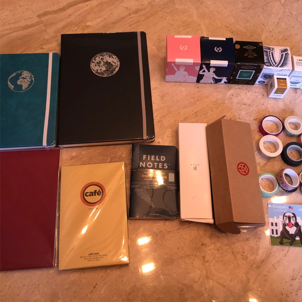
I was sad not to see Brad with his stationery company Nock Co., or Ana working at the Vanness table! But there were still so many great companies there. My new favorite is Odyssey Notebooks, created only recently by Rainbow! I was fangirling over her celestial and mythology themed notebooks on Reddit and Instagram, so it was great to see her there. Her notebooks use the last of the Tomoe River 68gsm paper, with dot grid and numbered pages! There are also 160gsm notebooks perfect for bullet journaling. I was excited to see B5 size notebooks with TR paper, which I find to be very rare. Only my Good Inkpressions notebook is that size, but actually smaller. I will try to post a full review of the Odyssey Notebooks later.

One of my other favorite parts of the show is the Ink Testing Station. It consists of several tables filled with a rainbow of ink bottles, all from different brands. There are pieces of paper, dip pens, q-tips, cups of water, and paper towels available so anyone can test out the ink! I always bring my own dip pen and notebook to use. It’s a great way to try out new colors before buying them.

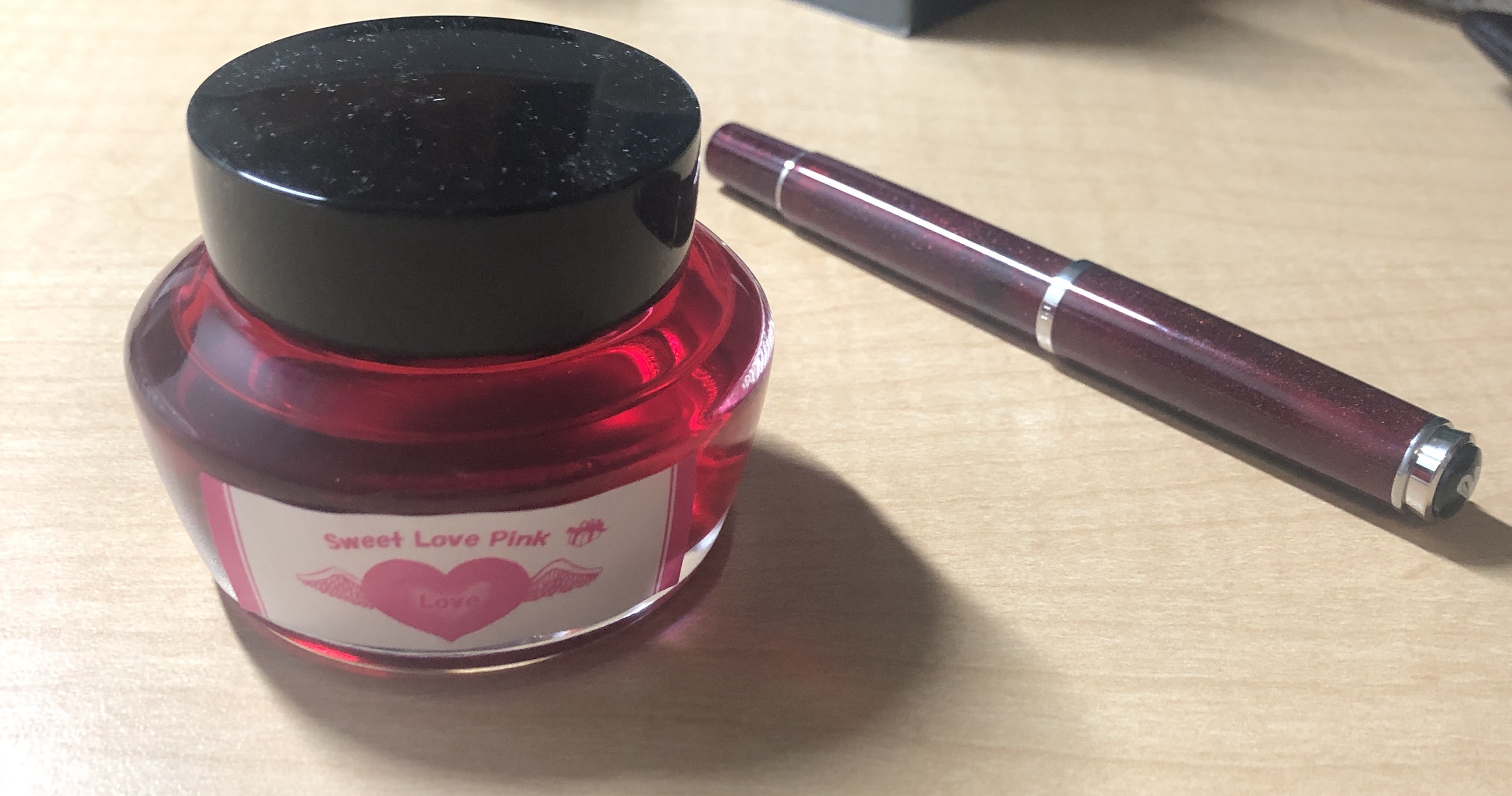
As for my haul, let me tell you all about it! I bought a Midori MD notebook for my mom, a Nanami A5 TR 68gsm notepad, a Nanami B6 notebook, two Odyssey Notebooks, one A5 and one B5, and Field Notes Snowy Evening. I only bought two pens, one a gorgeous Franklin Christoph 45 with a juicy medium nib and blue Diamondcast galaxy-like resin. The other was a TWSBI 580ALR Prussian Blue with a medium nib. I’ve had some issues with my TWSBI’s before, but this one works perfectly and holds 1.95ml of ink! I bought tons of ink, including the fun mythology-themed Laban Artemis and Aphrodite, as well as Taccia Navy Blue Jeans, Diamine Woodland Green, Sailor 123 for my friend, and Colorverse String (a replacement for KWZ Honey which I’m apparently allergic to). Finally, I got 11 washi tapes for $10.

I’m very glad I was able to attend the DC Pen Show. It almost felt like the world was going back to normal, though Delta is now upon us. Pen shows are the best way to try out new pens and inks, as well as interact with other stationery fanatics!

Valentine’s Day: Bungubox Sweet Love Pink

In honor of Valentine’s Day, I decided to do a review on my favorite pink ink ever, Bungubox Sweet Love Pink! It’s the brightest hue I’ve seen in the ink world! I got it as a sample and promptly used it up. But with the rebranding of Bungubox to include smaller bottles, I haven’t seen this ink available in a while. I was lucky to get this bottle on r/penswap. If only I had the sparkly pink pen based on this ink!

IMG_8394
Here’s Sweet Love with my Pelikan M205 Star Ruby

The bottle is the squat 50ml Sailor bottle, which is getting replaced with a smaller 35 ml shoe-shaped one. I took out the plastic inkwell inside because I get a better fill without it.

The ink is a bright bubblegum pink, with some shading and a bit of gold sheen. It’s a beautiful color that I haven’t seen anywhere else. Taccia Momo is more cherry and Lamy Vibrant Pink is darker. The ink is smooth and the perfect consistency, as expected from Sailor-formulated inks. Despite its bright hue, it’s surprisingly legible, even in smaller nib sizes. Using my old sample, I wrote a 15 page story with a Pilot medium nib and it’s not too hard to read. But in larger sizes, you can see shading from light to darker pink. I wrote my sample using a Pelikan M200 M nib and on Tomoe River 52gsm paper. It took about 20 seconds to dry fully. If you can find it anywhere, Sweet Love is the perfect Valentine’s ink!

I bought this ink with my own funds. I was not paid for this review. 

My Favorite Back to School Supplies

As a student, the stationery I use is essential to me! I like incorporating my favorite hobby into school while having pretty lecture notes. Although some students at my university use laptops, plenty of us still use paper and pens. Actually, writing notes by hand helps students to retain information better. So I wrote up a list of my favorite notebooks, pens, and pencils, among other items, that I use in my daily life.

Some factors that influenced my choices were price and accessibility. A student’s budget is much different than an adult’s when it comes to stationery. You can find notebooks for cheap, but they may not have the best paper. But other fountain pen friendly notebooks, like Tomoe River, are unsuited for taking quick notes. I like to splurge on stationery so my recommendations may be more money than some people are willing to pay for. For current students, check out your college bookstore. They stock Clairefontaine and Rhodia notebooks at mine! Here’s my daily carries:

Quo Vadis Scholar Weekly Planner, $16

IMG_0431

I found this planner at my college bookstore. They have a huge collection of Quo Vadis planners, from A6 size to 6 x 9 inches and with pretty covers. This is my third one, after using one each year! The Scholar has thick, bright white Clairefontaine 90g paper. It comes in a weekly format with plenty of space for each page, which is much more useful to me as a student than a page-a-day planner. Monthly spreads are helpful for writing down exam dates and paper due dates. A review of the Scholar is coming soon!

Kokuyo B5 Soft Ring, $11.75 at JetPens

IMG_0631

I love these notebooks because they have soft plastic rings that don’t bite into my hand as I write (yes I’m a leftie). They have silky, thick ivory paper with light 7mm lines, perfect for fountain pens. The paper doesn’t take too long to dry either. Mine have 80 sheets/160 pages, enough for my copious note taking.

Clairefontaine A4 Spiral Bound, $7 at Goulet Pens

IMG_0625

For Latin class, I need a giant notebook for me to stuff all my notes and tears into. The Clairefontaine A4 does the job. It has enough space for writing down all the declensions and conjugations my heart desires. It’s also super sturdy and lasts the entire semester in my bag. It has 50 sheets/100 pages.

Pilot Metropolitan and Kakuno, Lamy Safari

IMG_0647

The Pilot Metropolitan and Kakuno are often considered the best beginner fountain pens. They’ve been part of my collection since the beginning. I don’t feel too bad about losing them so they are carried around the most. I love their smooth M nibs that show off shading and sheen. The Lamy Safari is light but balanced in my hand. I love its slightly pebbly texture. It has a juicy M nib.

Blackwing pencils

IMG_0636

This is certainly the more expensive choice of pencils, but I have no self control when it comes to limited editions. I love how smooth these pencils are. They put down lovely dark lines. The limited edition pencils are gorgeous. My favorite is the Blackwing 54, which I reviewed here. It has a Surrealism art theme. I use them for Latin and math classes, where I can erase my mistakes easily.

Papermate Flair

IMG_0643

If I don’t use a fountain pen, I use a Papermate Flair. They’re cheap, come in numerous colors, and take only a few seconds to dry. I like color coding notes in Latin with them, or with their cousin, the Papermate Inkjoys.

Nock Co. Holdout, $25 

IMG_0646
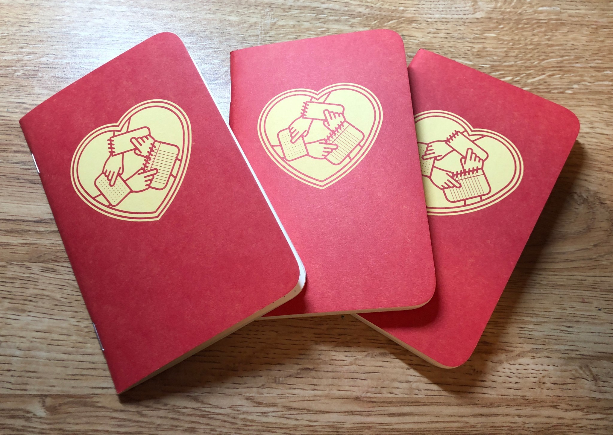
The Holdout is a sturdy case that can hold three fountain pens. I don’t need to carry my entire collection around (but sometimes I still do lol). I love Nock Co. cases because they are made of flexible canvas instead of leather. I don’t worry about tossing it into my backpack.

Other Supplies:

  • Mini stapler
  • earbuds
  • sticky notes/tabs
  • Blank index cards for Latin and Art History
  • Anker battery charger

Self explanatory. My mini stapler has saved me when a paper is due but there’s no stapler in the vicinity! Earbuds are essential on campus when you’re studying in the library, walking to class, sitting on the grass chilling out, etc. I also carry around flashcards in a plastic case because Latin and Art History classes use up SO MANY of them. Another essential is a battery charger. My phone loses battery so quickly that I carry one around in case. I bought an Anker one on Amazon for around $25.

I hope you enjoyed my daily carry post! It was fun to write.

Ink Inventory 2019!

I did some late summer cleaning of my room last week, which involved clearing off my entire desk of all fountain pens, inks and notebooks. :O I took the chance to count up all my inks I’ve bought over the last three years of my obsession/hobby.

The final count: 64 bottles! I’ve made a list of all the brands I have, sorted by amount.

  • Robert Oster: 8 bottles
  • Monteverde: 7 bottles
  • Pilot Iroshizuko: 6 bottles
  • Sailor: 6 bottles
  • J. Herbin: 5 bottles
  • Kobe: 3 bottles
  • Kingdom Note: 3 bottles
  • Kyo No Oto: 3 bottles
  • PenBBS: 3 bottles
  • Lamy: 3 bottles
  • Diamine: 3 bottles
  • Taccia: 2 bottles
  • Bungubox: 2 bottles
  • Krishna Inks: 2 bottles
  • Callifolio: 1 bottle
  • Papier Plume: 1 bottle
  • Organics Studio: 1 bottle
  • Colorverse: 1 bottle
  • Noodler’s: 1 bottle
  • Nemosine: 1 bottle
  • Akkerman: 1 bottle
  • Vinta: 1 bottle

Robert Oster and Monteverde top the list in terms of amount of bottles. Not only are they wet, shading inks but they also are much cheaper than Japanese inks. I buy them because they’re inexpensive and come in many colors. J.  Herbin is also nice and only felt watery in Perle Noire, which I promptly gave away. Iroshizuko and Sailor are my absolute favorite brands but because of cost I don’t have as many. They exhibit the best shading and sheen!

My favorite inks overall are Iroshizuko Ku Jaku, Iroshizuko Yamabudo, Sailor Sky High, Sailor Apricot, Monteverde Ocean Noir, Lamy Dark Lilac, Kobe #48, Robert Oster Cherry Blossom, Bungubox June Bride, J. Herbin Rouge Grenat, all my Kingdom Note inks, and Taccia Uguisu. I love teal, blue and red inks most of all. I’m most proud of getting a bottle of Lamy Dark Lilac and several boxes of cartridges! It was a lucky find at the D.C. Pen Show in 2016. I missed all the hype about it before because I was just getting into the hobby then.

Here are some individual pictures of my collection. I put them in a slide show so you can see them.

This slideshow requires JavaScript.

Most of the inks I disliked I got rid of, but there are still some in my collection I’m meh about. I enjoyed Robert Oster Frankley Blue until dried ink crystals from the bottle cap exploded all over my desk. Nemosine Coalsack Nebula is a beautiful shimmer ink but clogs so much. J. Herbin Emerald of Chivor was the most hyped ink of 2016 but didn’t live up to my expectations.

My emptiest bottle is Ku Jaku, because it’s a beautiful teal but mostly because its cap is cracked and there was a leak at some point. I only have 1/3 left. Yamabudo is close, with 2/3 left. Robert Oster Frankley Blue and Sailor Okuyama also have a good amount used up, also because of leaks. The rest aren’t even close! The problem with having so many inks is that I use different colors each time I write. It never gets boring but I also go through inks slowly.

I hope you enjoyed looking at my ink collection!

Notebook Shopping at CVS

I continued my quest for back to school composition books, but I didn’t see much at my local CVS. There was one CVS brand set of notebooks out. Here’s a quick review:

CVS Brand Composition Book

  • 100 sheets
  • A few dollars?

IMG_0459

The cover is made of a thick cardstock with a purple cosmic pattern. The twee words, “Make Today Magical”, are printed in silver letters. I like the white tape that binds the notebook. The design is pretty terrible. It feels like it was trying to be hip like the Target designs but also as low-budget as possible.

The paper itself is slightly rough. It has light blue lines for once! Ink performs okay. There is no feathering but no shading or sheen either. Ink went down smooth and dried very quickly.

Looking at the back, there is moderate show through but no bleeding. It doesn’t look as bad as the picture!


Overall, I wouldn’t recommend. The design is really ugly compared to some of the lovely Target designs and the paper isn’t that good. I want to hit Staples soon and also review some notebooks from my school bookstore! Also look out for an overview of all my fountain pen inks.

Ink Review: J. Herbin Corail des Tropiques

Lately, I’ve been searching for more unusual ink colors. My collection is mostly blue, purple and red which gets boring. One of my new favorites is J. Herbin Corail des Tropiques. It comes closer than any other ink in capturing the summery coral color. The ink itself comes in a small 30ml bottle. It’s possible to suck up ink without using a syringe, but I’d recommend one anyways because the bottle is so small.

The color is a lovely pink with orange tones. My photo shows it as more orange than it is! The ink is smooth in my Faber-Castell Ambition with a medium nib. It isn’t watery like other J. Herbin inks sometimes are. In the M nib, the color is dark enough to be legible. It is harder to read in long passages. I wrote a ten page story using this ink and I had some trouble reading my text at first. However, my eyes got used to the light tone. I would use a larger nib with this ink.

Monteverde Coral, a similarly named ink, is much darker and oranger. I really didn’t like it so I don’t have any picture to show. :/ So Corail is the best option for a coral-colored ink! It may be too light for some people’s eyes but I enjoy it overall as a summery ink.

2019 D.C. Pen Show!

Long time, no see! It’s been several months, but I’m finally back from the dead to blog once more. I always feel sad when I see people’s abandoned blogs floating in the vast internet but now that’s me! It takes SO MUCH work and dedication to keep a blog going, especially when social media is easier and gives instant validation. But blogs and reviews in particular are great for giving more information before purchasing expensive stationery. So, I’m back to my blog to give you quality reviews! Also I finally linked my own domain to the site, so links should redirect to notebookjoy.com instead of notebookjoy.wordpress.com hopefully!

If anybody is interested, the reason I’ve been away is that spring semester of college was really stressful. O_O Turns out I shouldn’t have had a campus job while taking five classes and trying to socialize and find internships. This summer I’m working more than I would prefer but at a much cooler job — at a used bookstore! I feel like I’m in an indie romcom movie sometimes, but with more annoying customers. I’m also learning to drive by myself without being terrified and cooking simple meals in preparation for my apartment next semester. So this summer has been productive even if I haven’t read or written too much. I also went to Portugal and found nice stationery there. Maybe I’ll post a quick review.

I also went to the D.C. Pen show, for my fourth year! Sadly I only went a few hours on Saturday but it was so much fun. I also RSVPed to join my local pen group for dinner! I focused on purchasing “unusual” inks, since I have most colors at this point. Interesting notebooks and leather products were also on my list. But I didn’t expect to come away with a Franklin-Christoph Pocket 66 pen with a gorgeous lava resin! Walking by the F-C table, this pen instantly grabbed me. Normally, I ordered expensive pens online after much research, but I gave in and bought it for $180 with a speciality SIG medium nib. It felt good having a job to give me extra money. 🙂

The pictures don’t do it justice! The Pocket 66 glows iridescent under a light source, lit up with swirls of yellow and orange and red. It is the perfect size posted for my small hands. I got it as an eyedropper, my first one. I’ll be very careful with it, so no bringing it to class in case it explodes.


I also bought several notebooks, Life Stationery Spiral, Life Stationery Vermillion, Life Stationery Recent Memo, and Kyopodo Notebook, all from Vanness Pens. The Vanness table is always so friendly and has a great selection. I liked the lady at the Sailor USA table too, she helped me pick out a Bungubox to buy, Clown Tears. Sadly, Brad from the Pen Addict wasn’t at the show this year so I didn’t get to say hi. Neither was Anderson Pens. As for inks, I bought Robert Oster Rose Gilt Tint, Bungubox Clown Tears, Kobe Arima Amber, Akkerman Sapgroen, Pilot Iroshizuko Tsutsuji, Krishna Brown Pink, PenBBS 137 Wisteria, Vinta Sirena and Sailor Yodakai. I also got a beautiful three pen leather case from Galen Leather! I love the smell and how supple the brown leather is! I wanted to buy the Galen Writing Box so badly but resisted the temptation.


Even better than the show was going out to dinner with the D.C. Metro Pen Crew, my local pen group. We all compared purchases and tried out each others pens. I’ve never felt so included in a hobby before. Everyone understands what I’m talking about for once! Even though I was the youngest there, I had an easy time making friends and talking about our shared passions. My advice for any convention goers is to meet up with people after the con, whether it’s online friends or a local group or people you meet in the hotel bar! Even better than buying stationery are the friends you make along the way.

For my few readers, thanks for still being there! I appreciate it.

Baron Fig Wander Dream Journal Review

Specs:

  • thick fountain pen friendly paper
  • 5.4″ x 7.7 inches, slightly smaller than A5
  • 192 pages
  • $24
  • numbered pages!
  • long ribbon bookmark!!
  • elastic band!!!

I finally got around to buying Baron Fig’s dream journal at the Baltimore Pen Show! You can tell how much I love BF in this post but this is my first review of their products. There’s just something about the clothbound cover, thick paper, and creativity that goes into each edition that draws me in. Baron Fig is best known for creating the Confidant notebook, but over time they have expanded to softcover Vanguards, pens, pencils and other stationery supplies.

IMG_2959

The Wander Dream Journal is a guided edition, meaning that it has templates printed on the page. BF doesn’t just want you to write your dreams down haphazardly but organize and analyze them. That sets it apart from other journals I’ve seen before.

Appearance:

The journal is a beautiful night sky blue, embossed with silver stars and a crescent moon. I love running my hand across the cloth cover. It is textured and sturdy but prone to staining if you’re not careful. Even better are two important additions: a longer bookmark and an elastic band! These satisfy the few quibbles I had with Baron Fig notebooks in the past.  The bookmark is a sky blue color while the elastic is a gray. I wish this notebook was available as a normal lined or dotted edition. I’d buy a stack of them!

The box itself is amazing too, decorated with beautiful surreal art that mimics a dream scape. BF definitely knows how to design a beautiful package.


Paper:

Inside, there is lovely, psychedelic endpaper with a space to put your name. The pages are numbered, which is helpful for reference. There are enough pages to write down 92 dreams! The first spread introduces the various symbols you can check mark to further categorize your dream.


  • Emotion: your mood during the dream
  • Sleep Quality: did you sleep well or not?
  • Time: Did the dream take place in past, present or future?
  • Color: Did you dream in color or monochrome?
  • Viewpoint: 1st or 3rd person perspective
  • Type: Is this dream Recurring, Lucid, Mundane, Fantasy or Nightmare?

These symbols made me think more about the significance of my dream and how it happened. This is important when you wake up and rapidly start forgetting a dream! BF did a great job designing these categories.

On the pages themselves are spaces for recalling, drawing and interpreting the dreams. At the top is a space to write the date and day of week. Recalling the dream took up the whole left page, while the right page was split between room for drawing and interpreting. The ruling was lined. I wish that there was more room for interpretations because I’m not a great artist and didn’t use up much of that space.


The paper is good for fountain pens and any other writing instruments. However, the paper feels lighter weight and the pages almost curl up on their own. Usually, they are very thick and lay flat. Maybe BF changed their supplier? I will do more research and buy a regular Confidant to test at some point. I used a Pelikan F nib with Bungubox June Bride ink to write down my dream. There was shading, but it does look a bit flat compared to Tomoe River, my paper of choice. To be honest, everything looks dull compared to TR! There was no feathering nor bleed through. There was some show through. Ink dries very fast on the uncoated paper. I didn’t smear any of my text with my left hand, as I usually do.

IMG_2973
Back of paper with some show through

Here’s my dream, if you have the patience to read it! And the showthrough is in the third picture.


I’m quite stressed out with midterms so this was probably a nightmare looking back on it. I used to have dreams about zombies breaking into a house I was hiding in (I watched too much Walking Dead as a 12 year old) but now most dreams have me wandering in a labyrinth where I can’t escape, whether it’s in an airport, school, or mall setting??? What do you dream about?

Conclusion:

This is an incredibly cool journal! I keep it by my bedside so I wake up and start writing in it immediately. Baron Fig is coming up with such innovative ideas lately. They also sell a recipe and guided planner book if you’re interested. The Wander Dream Journal is a good motivator to write down your dreams, before they disappear forever.

I bought this notebook with my own funds. I was not paid for this review. 

Baltimore Pen Show!

One reason I love living near DC is the surprising abundance of stationery. Not only can I visit great stores like Jenni Bick and Fahrney’s Pens and go to local meetups like the DC Metro Pen Crew, but there are two major pen shows nearby! Those two are the DC Pen Show and the smaller Baltimore Washington Pen Show. I went to BWPS last year and was delighted by the small, cozy atmosphere. This year I went with my parents and college friend Klaudia!

There isn’t the largest selection of inks, pens and notebooks, but it’s much easier to talk to store owners and pen sellers! And that’s why smaller conventions are my favorite. It’s not just about buying every pen in sight, but talking to people from all over the world. The DC Pen Show is great but can be overwhelming. Baltimore doesn’t have the huge crowds and narrow aisles you have to squeeze through.

It’s always amazing talking to my favorite creators, bloggers, sellers and artists! Shout out to Brad Dowdy, who is legit the nicest person ever. His blog, Pen Addict, is the first fountain pen blog I ever read. I also love the Vanness Pens table, Drama Mama Bookshop (the creator, Alisa, is so talented and nice! Check out her laser cut notebooks), Bertram’s Inkwell, DC Metro Pen Crew and the Yafa table. Thank you Niv for being so kind and helping my mom pick out a rollerball pen! 🙂

IMG_2713

I didn’t buy a lot this year which was a good thing! The Taccia inks drew my eye so I bought Momo, a beautiful eye-searing pink, and Ugisu, an olive green. I was so tempted to get the Taccia pen show special but decided against it… As for notebooks, I got the Baron Fig dream journal, a Drama Mama laser-cut journal and a Curnow Bookbinding Tomoe River paper notebook.  Some other items include the Nock Co. Sinclair Case, Pen Addict Fire on Fire ink (Thank you Brad), Monteverde Coral (Also thank you Niv), Monteverde Rose Noir, J. Herbin Rouge Grenat, J. Herbin Corail des Tropiques, some assorted stickers and a pen and ink samples for my friend I’m trying to convert to fountain pens. 🙂

I had a great time today. The fountain pen community is such an amazing community! I love seeing people of all ages and backgrounds united by their love of pens.

Pay It Forward Kickstarter Rewards!

This weekend, I finally received my $20 rewards for backing the Pay it Forward Kickstarter! For those who don’t know, Pay it Forward is a group of fountain pen enthusiasts who want to make the community a more welcoming and inclusive place for newcomers. You can send your unused notebooks, pens and ink samples for them to hand out. Since 2017, they have travelled to many pen shows and offered a table with free pen kits for newcomers to the hobby and children. They also have a table for donated new notebooks! Last DC Pen Show, I dropped off all my extra Field Notes, limited editions and other goodies that were previously sitting in a shelf. It felt very good to give away paper for others to use! For myself, I picked out a little pen bag and found inside an amazing demonstrator Jin Hao pen and sample vial of ink.

I wish this group was around when I first started my obsession in 2016. I figured out what pens and ink and paper I liked through trial and error. The pen community was still a bit intimidating to me at the time so I didn’t participate online. Pay It Forward both recycles stationery and creates a welcoming atmosphere.

PIF created a kickstarter last year to raise more money for tables at pen conventions and to spread the word. I donated $20 for a pack of Story Supply Co x Pay It Forward dot grid notebooks and a bottle of “Heart of Gold” ink, made by Papier Plume.

IMG_2107IMG_2111 2

The notebooks are a reddish-orange and yellow. On the cover is the PIF logo, three hands holding stationery items. Inside is a place to write your name, date, and location. On the back cover is the mission of PIF. I liked that the cover was not a uniform red, but had yellow undertones. The paper is moderately fountain pen friendly like other SSC notebooks. The dot grid is a bit dark for me, but is much lighter than the Elemental notebook grid.

As for the ink, it’s a dark orange, with some nice shading. It reminds me of a sunset. The flow is nice and wet in my Sailor 1911S Medium nib. Compared to other inks I have, Sailor Apricot is lighter and has a silver sheen. Monteverde Ruby is much redder, like tomato soup.


I love PIF’s mission of creating a welcoming community. I’m happy to support their kickstarter and hope to see more PIF tables in the future.

I bought these products with my own funds. I was not paid for this review.