Valentine’s Day: Bungubox Sweet Love Pink

In honor of Valentine’s Day, I decided to do a review on my favorite pink ink ever, Bungubox Sweet Love Pink! It’s the brightest hue I’ve seen in the ink world! I got it as a sample and promptly used it up. But with the rebranding of Bungubox to include smaller bottles, I haven’t seen this ink available in a while. I was lucky to get this bottle on r/penswap. If only I had the sparkly pink pen based on this ink!

IMG_8394
Here’s Sweet Love with my Pelikan M205 Star Ruby

The bottle is the squat 50ml Sailor bottle, which is getting replaced with a smaller 35 ml shoe-shaped one. I took out the plastic inkwell inside because I get a better fill without it.

The ink is a bright bubblegum pink, with some shading and a bit of gold sheen. It’s a beautiful color that I haven’t seen anywhere else. Taccia Momo is more cherry and Lamy Vibrant Pink is darker. The ink is smooth and the perfect consistency, as expected from Sailor-formulated inks. Despite its bright hue, it’s surprisingly legible, even in smaller nib sizes. Using my old sample, I wrote a 15 page story with a Pilot medium nib and it’s not too hard to read. But in larger sizes, you can see shading from light to darker pink. I wrote my sample using a Pelikan M200 M nib and on Tomoe River 52gsm paper. It took about 20 seconds to dry fully. If you can find it anywhere, Sweet Love is the perfect Valentine’s ink!

I bought this ink with my own funds. I was not paid for this review. 

Ink Inventory 2019!

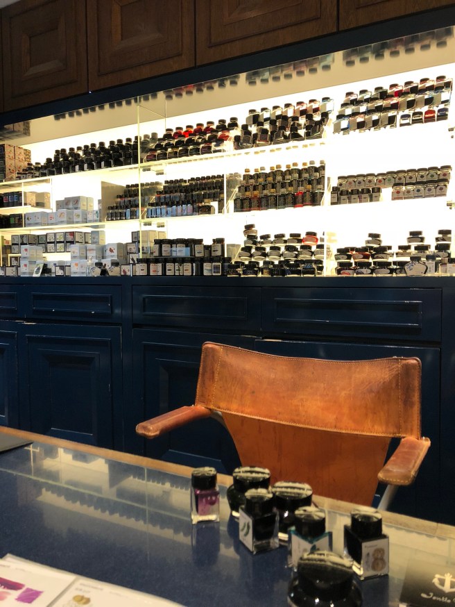
I did some late summer cleaning of my room last week, which involved clearing off my entire desk of all fountain pens, inks and notebooks. :O I took the chance to count up all my inks I’ve bought over the last three years of my obsession/hobby.

The final count: 64 bottles! I’ve made a list of all the brands I have, sorted by amount.

  • Robert Oster: 8 bottles
  • Monteverde: 7 bottles
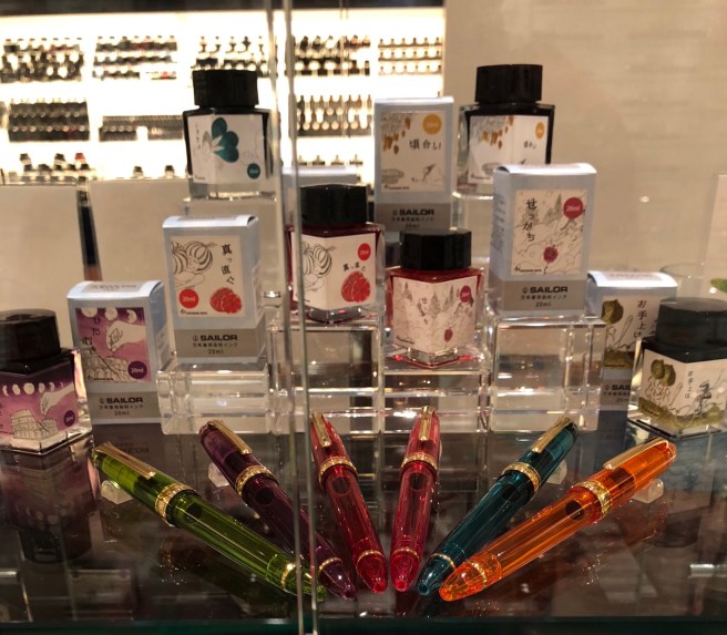
  • Pilot Iroshizuko: 6 bottles
  • Sailor: 6 bottles
  • J. Herbin: 5 bottles
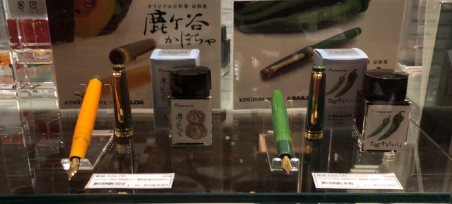
  • Kobe: 3 bottles
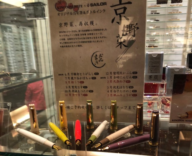
  • Kingdom Note: 3 bottles
  • Kyo No Oto: 3 bottles
  • PenBBS: 3 bottles
  • Lamy: 3 bottles
  • Diamine: 3 bottles
  • Taccia: 2 bottles
  • Bungubox: 2 bottles
  • Krishna Inks: 2 bottles
  • Callifolio: 1 bottle
  • Papier Plume: 1 bottle
  • Organics Studio: 1 bottle
  • Colorverse: 1 bottle
  • Noodler’s: 1 bottle
  • Nemosine: 1 bottle
  • Akkerman: 1 bottle
  • Vinta: 1 bottle

Robert Oster and Monteverde top the list in terms of amount of bottles. Not only are they wet, shading inks but they also are much cheaper than Japanese inks. I buy them because they’re inexpensive and come in many colors. J.  Herbin is also nice and only felt watery in Perle Noire, which I promptly gave away. Iroshizuko and Sailor are my absolute favorite brands but because of cost I don’t have as many. They exhibit the best shading and sheen!

My favorite inks overall are Iroshizuko Ku Jaku, Iroshizuko Yamabudo, Sailor Sky High, Sailor Apricot, Monteverde Ocean Noir, Lamy Dark Lilac, Kobe #48, Robert Oster Cherry Blossom, Bungubox June Bride, J. Herbin Rouge Grenat, all my Kingdom Note inks, and Taccia Uguisu. I love teal, blue and red inks most of all. I’m most proud of getting a bottle of Lamy Dark Lilac and several boxes of cartridges! It was a lucky find at the D.C. Pen Show in 2016. I missed all the hype about it before because I was just getting into the hobby then.

Here are some individual pictures of my collection. I put them in a slide show so you can see them.

This slideshow requires JavaScript.

Most of the inks I disliked I got rid of, but there are still some in my collection I’m meh about. I enjoyed Robert Oster Frankley Blue until dried ink crystals from the bottle cap exploded all over my desk. Nemosine Coalsack Nebula is a beautiful shimmer ink but clogs so much. J. Herbin Emerald of Chivor was the most hyped ink of 2016 but didn’t live up to my expectations.

My emptiest bottle is Ku Jaku, because it’s a beautiful teal but mostly because its cap is cracked and there was a leak at some point. I only have 1/3 left. Yamabudo is close, with 2/3 left. Robert Oster Frankley Blue and Sailor Okuyama also have a good amount used up, also because of leaks. The rest aren’t even close! The problem with having so many inks is that I use different colors each time I write. It never gets boring but I also go through inks slowly.

I hope you enjoyed looking at my ink collection!

Ink Review: J. Herbin Corail des Tropiques

Lately, I’ve been searching for more unusual ink colors. My collection is mostly blue, purple and red which gets boring. One of my new favorites is J. Herbin Corail des Tropiques. It comes closer than any other ink in capturing the summery coral color. The ink itself comes in a small 30ml bottle. It’s possible to suck up ink without using a syringe, but I’d recommend one anyways because the bottle is so small.

The color is a lovely pink with orange tones. My photo shows it as more orange than it is! The ink is smooth in my Faber-Castell Ambition with a medium nib. It isn’t watery like other J. Herbin inks sometimes are. In the M nib, the color is dark enough to be legible. It is harder to read in long passages. I wrote a ten page story using this ink and I had some trouble reading my text at first. However, my eyes got used to the light tone. I would use a larger nib with this ink.

Monteverde Coral, a similarly named ink, is much darker and oranger. I really didn’t like it so I don’t have any picture to show. :/ So Corail is the best option for a coral-colored ink! It may be too light for some people’s eyes but I enjoy it overall as a summery ink.

Pay It Forward Kickstarter Rewards!

This weekend, I finally received my $20 rewards for backing the Pay it Forward Kickstarter! For those who don’t know, Pay it Forward is a group of fountain pen enthusiasts who want to make the community a more welcoming and inclusive place for newcomers. You can send your unused notebooks, pens and ink samples for them to hand out. Since 2017, they have travelled to many pen shows and offered a table with free pen kits for newcomers to the hobby and children. They also have a table for donated new notebooks! Last DC Pen Show, I dropped off all my extra Field Notes, limited editions and other goodies that were previously sitting in a shelf. It felt very good to give away paper for others to use! For myself, I picked out a little pen bag and found inside an amazing demonstrator Jin Hao pen and sample vial of ink.

I wish this group was around when I first started my obsession in 2016. I figured out what pens and ink and paper I liked through trial and error. The pen community was still a bit intimidating to me at the time so I didn’t participate online. Pay It Forward both recycles stationery and creates a welcoming atmosphere.

PIF created a kickstarter last year to raise more money for tables at pen conventions and to spread the word. I donated $20 for a pack of Story Supply Co x Pay It Forward dot grid notebooks and a bottle of “Heart of Gold” ink, made by Papier Plume.

IMG_2107IMG_2111 2

The notebooks are a reddish-orange and yellow. On the cover is the PIF logo, three hands holding stationery items. Inside is a place to write your name, date, and location. On the back cover is the mission of PIF. I liked that the cover was not a uniform red, but had yellow undertones. The paper is moderately fountain pen friendly like other SSC notebooks. The dot grid is a bit dark for me, but is much lighter than the Elemental notebook grid.

As for the ink, it’s a dark orange, with some nice shading. It reminds me of a sunset. The flow is nice and wet in my Sailor 1911S Medium nib. Compared to other inks I have, Sailor Apricot is lighter and has a silver sheen. Monteverde Ruby is much redder, like tomato soup.


I love PIF’s mission of creating a welcoming community. I’m happy to support their kickstarter and hope to see more PIF tables in the future.

I bought these products with my own funds. I was not paid for this review. 

Stationery Shopping: Kingdom Note

My first stop of the day was at Kingdom Note! I’ve heard so much about this place. It’s a store that stocks pens, inks and notebooks. It has an exclusive line of inks that are inspired by animals and plants. Kingdom Note also collaborates with the Sailor company to make veggie themed pens! These store-exclusive products are not available in the U.S. I’ve seen them on Ebay for exorbitant amounts of money but I’d rather not pay those prices.

The store is on the 6th floor of a building in Shinjuku and is hard to see from the street. You will see a sign for KN and a camera shop. Luckily, its 5 minutes from my hotel!

The store was smaller than I thought it would be. Only a few people work there. The attendant helping me was really nice and he knew enough English for us to communicate. The store was filled with a wide variety of fountain pens, many of them European. The small selection of Nakayas dazzled me. There was a rack of notebooks, but nothing very special. My eyes were immediately drawn to the vegetable themed pens and the giant wall of ink. I bought a “green pepper” fountain pen in a broad nib but there was also a pumpkin themed one. You could buy matching 20ml inks for it. I certainly did! There were also demonstrators in bright colors but I already spent all my money for the day. 😛

I also tested a variety of inks. There’s a whole wall of them, both European and Japanese! I was given a binder full of ink sample cards then I chose which one to try. The attendant let me test them with a glass pen. I bought three inks, two of them in 50 ml bottles and the other in a tiny 20ml one. I bought the Mycena pura, a dusty pink color based on mushrooms. I first heard about it from a post on Reddit, but I thought I would never buy it! I also got Thysanostoma thysanura, a pinkish purple like a jellyfish. And I bought the matching green pepper ink to go with my pen. When I get back from Japan, I hope to have ink reviews up for them.

Make sure to get the tax refund taken care of! Foreigners have to pay an 8% tax rate for some purchases, but you can get it refunded in kiosks and at the airport. I got a slip of paper with my purchase that I can turn in later.

The people working there were really kind and I felt welcomed inside the store. I’m glad I got the opportunity to go to a small boutique style store.

Tomorrow I’m going to Mt. Fuji on a tour but hopefully I’ll get to Itoya Ginza and Maruzen Nihombashi soon. I also added the Tools art supply store and Smiths to my list. It’s in the Lumine Est department store underneath the Shinjuku train station. I’m going to get Copic markers there. I will post more about the pen stores I visit!

Lamy Vibrant Pink Ink Review

The Lamy limited edition inks have both enchanted and disappointed me. I discovered the fountain pen world right after the beautiful Lamy Dark Lilac ink sold out. Luckily, I bought a lifetime supply of cartridges at the D.C Pen Show. Petrol didn’t appeal to me at all, so I let that one pass by. Like everyone else, I was annoyed to find out Pacific blue wasn’t a new color (still bought it though). Now Lamy Vibrant Pink comes out, and I’m in love again.

IMG_4286

I bought the ink cartridges, $4.50 for five. This isn’t an eye-searing bubblegum pink like I feared it would be. It’s fun and different than others I’ve seen before. VP shades beautifully. Its color ranges from bright pink to a darker raspberry. It’s not garish but does stand out. I love using unusual ink colors so it’s great for me. It’s very legible and doesn’t strain the eyes. I used this ink to take lecture notes. Even better, VP has a touch of golden sheen! Not too much, but enough to make VP stand out from other pink inks I’ve tried. Just like Lamy Dark Lilac, the sheen needs to be coaxed out with good paper. It’s not visible on my sample paper, Rhodia No. 13 dot grid, nor my Maruman Spiral Note. Tomoe River is magical unicorn paper and brings out its subtle golden sheen. Surprisingly, Kokuyo Campus paper does too!

This ink is well-behaved in my Lamy Safari and doesn’t skip at all. Dry time is under 10 seconds, which is great for my note-taking needs. However, there is one drawback, something I’ve found with almost all red/pink inks. There’s extreme nib creep??? if that’s the right word for it. It’s because red/pink inks are more saturated than green/blue ones, so they leave behind residue on the nib. So my Lamy nib looks really gross.

IMG_4268
EWWWWWWW

But this has happened with Diamine Red Dragon, Monteverde Red, KWZ Crimson, etc. so it isn’t unusual. Wipe it off with a tissue if it bothers you.

This is the first pink ink I enjoy! I need to stock up on another bottle or three…

Monteverde Ruby Ink Review

This is my first review, yay! Today, I tested Monteverde Ruby. It was $8 for 30ml. I don’t mind the smaller size because I never finish bottles anyway. I bought it at the Baltimore Pen Show, among other goodies. 🙂 Red is one of my favorite colors (besides teal) so I’m always on the lookout for new red inks to try.

fullsizeoutput_671
I tried to make the color more accurate, need to work on better lighting

This ink leans more towards orange-red, rather than being a true red. I expected more of a dark ruby color. But I was pleasantly surprised! Ruby reminds me of a flickering flame with its beautiful orange shading. Either that or tomato soup! There is no sheen, but this ink doesn’t need any to stand out. It has a lot of character and isn’t as flat as another favorite, Diamine Red Dragon. (Review forthcoming!) It’s a perfect shade to use in fall because it looks like autumn leaves.

Monteverde claims that its line of ink is lubricated, to stop the nib from drying out. As a result, I found Ruby very wet and certainly lubricated. On Rhodia dot grid paper, the ink dried completely after 15 seconds. I don’t have a photo of it, but on Tomoe River paper it took forever to dry. I accidentally smeared it after 30 seconds. So be careful if you use it on TR. I tend to use more absorbent, fast-drying paper so it doesn’t bother me.

If you’re looking for a beautiful, autumnal red ink, then Monteverde Ruby is a great choice! However, it doesn’t top Diamine Red Dragon as my favorite red ink.

fullsizeoutput_67b
Beautiful shading!
fullsizeoutput_677
I tried to draw a campfire…