Write Notepads “The Lawn” Review

I live in a suburbia of rolling green lawns, as far as the eye can see. Even in the summer, the grass is trimmed to perfection. Well-kept lawns are always in my summertime memories. I remember getting green stains on my knees, running through sprinklers and tall grass, swimming and roasting smores on a campfire. Maybe that’s why Write Notepads’ “The Lawn” edition touched me so much. Nostalgia is a powerful feeling.

IMG_3660

Specs:

  • 3.75” x 5.5” inches
  • 48 pages
  • 70# paper with 6.35 mm lines
  • three gold staples
  • 3 pack for $12.99

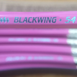
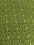
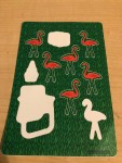
I reviewed the “Sakura” pocket notebook edition in a previous review. I enjoy this edition even more! However, I’m a bit late to the show. Johnny from Pencil Revolution also reviewed it here. Once again, Write Notepads came up with a simple yet creative theme. The notebook is slightly wider than the usual Field Notes 3.5 x 5.5 size. It gives me more space to write and it’s not like I actually put my pocket notebook in my pocket. πŸ˜› The notebook is a deep green, more olive than emerald. Tiny blades of grass are letterpressed on the cover. They seem slightly raised, giving it a texture when I run a hand over it. The Lawn is staple bound, with three sturdy golden staples. My three-pack was held together with a checkered red and white belly band, like a picnic blanket! My pack also came with a sheet of STICKERS!!! I love the whimsical art of garden gnomes, lawn chairs and flamingoes. They blend into the grassy cover perfectly. I hid the beer cans sticker on the back. πŸ˜‰ I forgot to take a pic before I used them, sorry about that!

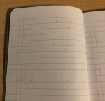
Inside is a luscious white paper perfect for fountain pens. It has 6.35 mm green lines that fit my writing perfectly. Write Notepads must have changed their paper formula because this and the Sakura is much better than the old stock. The paper is smooth but not slippery like Field Notes. It has enough tooth for pencil and feels great with my felt and gel pens.Β It handles literally every fountain pen I throw at it, even my juicy Pelikan and Faber-Castell nibs. There is only some feathering with my F-C nib. There is no bleed through and barely any show through. The only other paper I’ve found like this was Baron Fig and Rhodia/Clairefontaine. My nib doesn’t catch on the paper fibers nor does it feel scratchy.

For research, I bought a pack of “Samuel Morse” notebooks, a previous Write Notepads limited edition. Though they share the same attention to detail, the “Morse” notebooks are perfect bound, meaning the spine is glued. This makes it much harder for pages to lay flat. The paper is also not good for fountain pens. It feathers and bleeds to the other side. Ink colors look flat and lifeless. In comparison, “The Lawn” has crisp lines and shows shading, though not sheen.

In the past, I didn’t buy Write Notepads limited editions because of the perfect binding and paper. But staple-bound, fountain pen friendly notebooks are always welcome in my horde. I hope Write Notepads makes more editions like “The Lawn” and “Sakura”. Hopefully they have a table at the D.C. Pen Show so I can come and visit!

I bought these notebooks with my own funds. I was not paid for this review.Β 

Write Notepads Sakura Review

This post is a little late, but I’d like to review the newest limited edition from Write Notepads: the Sakura edition!

Specs:

  • 3.75” x 5.5” inches
  • 48 pages
  • 70# paper with 4mm grid
  • stapled!
  • 3 pack for $12.99

This is my first time trying Write Notepads. They make very nice pocket notebooks among other offerings. However, their editions usually have perfect binding, which is a type of binding that makes the notebook harder to keep open and lay flat. They also don’t have the best paper for fountain pens. But I saw the new Sakura edition and fell in love! I live near a place with many cherry blossom trees and I love seeing them bloom in the spring. They also are staple bound which is more my style.

I bought two packs, each set being $12.99 . I ordered the bundle which came with a special surprise. πŸ™‚ The Sakura is a little shorter than Field Notes, another popular notebook brand.

The covers are absolutely gorgeous. They’re a speckled cream color with cherry tree branches letter pressed onto the surface. Even the band holding the notebooks together is beautiful. It’s black with silver blossoms decorating it. So pretty!

The paper inside is very nice. It’s not as smooth as the Field Notes or Story Supply paper but it’s not rough like Baron Fig. It has a minuscule 4mm grid printed in light green. I definitely can’t fit my writing in the squares, so I just use it as a guide for my writing. Here is the grid in comparison to the one in my field notes:

img_4986.jpg

The paper is great! It has enough tooth for pencil but feels great with gel, felt and even fountain pens. I was expecting a lot of show through or bleed through but didn’t have any! Only a tiny bit of show through and bleeding. I wonder if they changed the paper or I happened to choose well-behaved ink for my pen test. In reviews of previous editions, bloggers have found the paper to not be fountain pen friendly. So this is a pleasant surprise!

And the add on was a letter pressed packet of cherry blossom seeds. It was a very thoughtful extra and I’ll have to find a place to plant them. These notebooks were also a good match with the pink Blackwing Volume 54 pencils. I love this limited edition and I am excited to see more from this company!

Β 


Surrealism is Awesome: Palomino Blackwing 54 Review

I first tried the esteemed Blackwing 602 pencil ($22 for a box of twelve) at the CW Pencil Enterprise last year. It’s much talked about in the pencil fandom so I was excited. It met my expectations, and so much more. The “firm” lead is smooth and creamy on paper. I was turned off from pencils after years of using ones that were scratchy and had broken lead.Β  I stopped using pencils during middle school, and never went back. Until now.

For the spring semester, I found a use for my new pencils. I used my Baron Archer #2’s for math problems and my Blackwing 602 for creative writing class, where I had to erase often. I’ve even used my pencil for sketching! So I was excited to see the new Blackwing Volumes release. Okay, at first I was disappointed by the color. But the pictures online don’t show how it actually looks. It’s gorgeous!

IMG_4953
This picture shows the color off best.

The theme is inspired by Surrealism, one of my favorite art movements. Surrealism is when artists take inspiration from their unconscious and dreams to create a bizarre, off-putting work. It followed the work of Freud, often showing what lurked in the hidden parts of your mind. Though most think of Salvador Dali or Rene Magritte, there were many women and people of color working in that style. Surrealism was a diverse movement that gained popularity in the Caribbean and Latin America. I’m happy that Blackwing listed underrepresented artists. Some other female surrealists include Leonora Carrington, Frida Kahlo, and Remedios Varos. Wilfredo Lam, mentioned on the box, was a famous Chinese-Cuban artist, who drew inspiration from his Afro-Cuban heritage for his paintings.

IMG_4937
They’re beautiful!

The shiny lacquer is a strange color, shifting like the color palette of Surrealists. It looked bubblegum pink in some pictures, magenta in others. Seeing it in person, the color is orchid, with just a hint of purple. The teal imprint and blue eraser add to the oddity of this pencil. It’s unusual, which I like.

I had a weird scratch on one of the ferrules, which annoyed me. I’m paying $25 for a box of 12 pencils, it better be perfect!

IMG_4956
Weird scratch on ferrule

The “extra firm” lead wasn’t as amazing as the 602’s was. But it has better point retention and is slightly harder, making it better for precise writing. Some bloggers theorized that the “extra firm” was the same as the Palomino HB. I tested that out, along with my other Blackwing pencils I have.

“Extra firm” is definitely a different lead. Palomino is even darker than the EF. Its line isn’t as dark as the 54’s. It has even better point retention and just had an overall different feel on the paper. I’d suggest both as good pencils, but they aren’t replicas. I also compared my “soft” and “firm” leads. The “soft” was the darkest, but smudged the most and lost its point quickly.

IMG_4959
Pencil test done on Baron Fig paper

I really enjoyed the 54 and its cool theme! They’re out of stock in many places, but there’s still some floating around if you look. Below are some of the works of the Surrealists mentioned on the box!

Also I found a list of awesome female Surrealists!

europe-after-rain
Max Ernst, Europe After the Rain (1940-42)
Meret-Oppenheim.-Object-469x311
Meret Oppenheimer, Object (1936)
self-portrait-along-the-boarder-line-between-mexico-and-the-united-states
Frida Kahlo, Self-Portrait Between the Borderline of Mexico and the United States (1932)
lam the jungle
Wilfredo Lam, The Jungle (1943)

Sources: